-
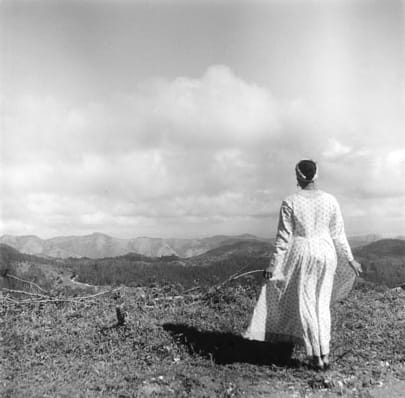
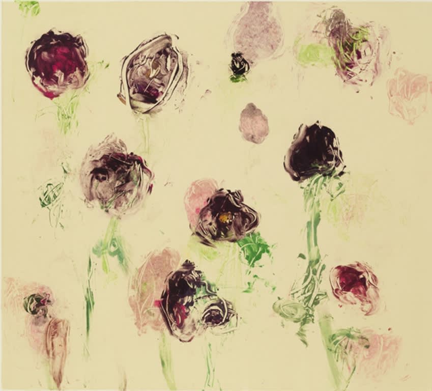
For the next few weeks, as part of the #5WomenArtists campaign, we're discussing areas of the art world that women artists are leading the way in defining what this type of art means in a contemporary context. Each week, we'll dive into a different area and pick five women artists we love that explores it in her work. This week, we're looking at women who work with the figure.
The body is so often central to the experience of being a woman. It is highly politicized, objectified, legislatively regulated, misunderstood and mishandled by the medical community, a source of great physical feats and miracles, an incubator or target for unique dangers and violence. It is decorated, disguised, hidden, exposed, manipulated, altered. When it's portrayed it is seen almost solely through the male gaze; it is scrutinized, criticised, broken down into parts. These challenges grow when they intersect with the treatment of bodies that exist outside of the cis straight white realm. Seeing these bodies through the eyes of women artists is intriguing for both their inherent artistic value and nature, as well as how their perspectives amplify all of these issues that arise via male artists that we've normalized. Here are five women artists whose work centers around explorations of the figure:
-
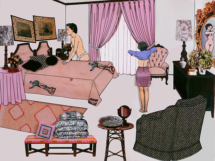
Laurie Simmons
For the next few weeks, as part of the #5WomenArtists campaign, we're discussing areas of the art world that women artists are leading the way in defining what this type of art means in a contemporary context. Each week, we'll dive into a different area and pick five women artists we love that explores it in her work. This week, we're looking at women who create work about domestic life.
Domesticity has been the realm of women for centuries, and as their lives expand beyond the walls that keep them within that world women artists are turning their sights back to the home with a discerning eye. Often intended as a metaphor for women's roles and struggles within society at large, their work challenges the connotations of the home with femininity, investigates the politics that relegate women to these spaces, and subverts symbolism associated with domesticity. Here are five artists that work with questions of domesticity:
-

For thie next few weeks, as part of the #5WomenArtists campaign, we're discussing areas of the art world that women artists are leading the way in defining what this type of art means in a contemporary context. Each week, we'll dive into a different area and pick five women artists we love that explores it in her work. To start, we're taking a look at textile art. We focused on this for our group show, "Following The Thread," last summer that featured our artists like Debra Smith and Emily Barletta, and now we'll open that up to the art world at large.
The distinct divide between the worlds of art and craft has been rapidly shrinking. Artists who work with textiles are being welcomed into the contemporary art world like never before. Drawn to the aesthetics or the cultural and political connotations of textiles, their work looks to the tenets of painting, applying notions of space, form, and color to their manipulation of fabric and thread. As the world of textiles has always been predominantly a place for women, so too are female artists making up a vast majority of those who are elevating these mediums to fine art. They subvert the notion that these materials are to be dismissed and relegated to the sidelines of the art world, and use their materials to create pieces that are often imbued with political and historical messaging. Here are the five artists we chose to exemplify the work that's been done in the realm of textiles:
-
For the past two years, we've been excited for The National Museum of Women in the Arts' #5womenartists campaign during Women's History Month. Getting people talking about women artists is something we're passionate about, and we have a lot to share this year. Our gallery is run by women (with the exception of our weekly visit from our art handler - thanks, Noah!) and 81% of the artists we represent are women, and it's been that way since the beginning. Last year, we spotted Kathryn Markel's name on a Guerilla Girls' piece in the Whitney that listed gallerists who dedicated at least 30% of their solo shows to female artists. When reviewing the season from 1984-1985, the list was shockingly small. In 2017-2018, there's still work to be done, but we still managed to find a lot of excellent shows in New York's galleries and museums that just happened to be by women artists. (Perhaps you've seen our monthly #artwalks in our Instagram stories!) Our Gallery Manager, Alyssa Alexander, and Marketing Associate, Celeste Kaufman, narrow down their lists to their 5 favorite exhibitions they saw since the last #5womenartists campaign:
-
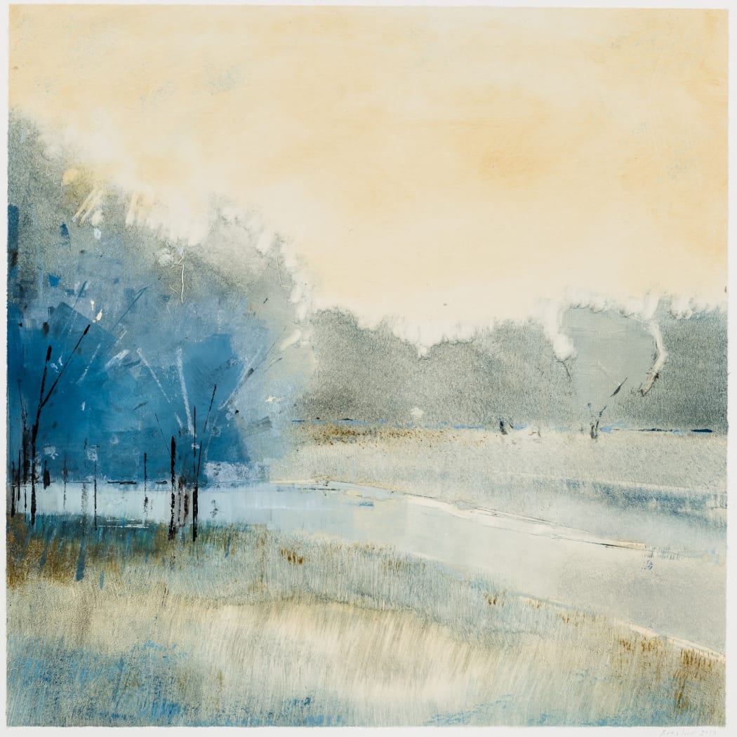 Lisa Breslow "Reverie 17"
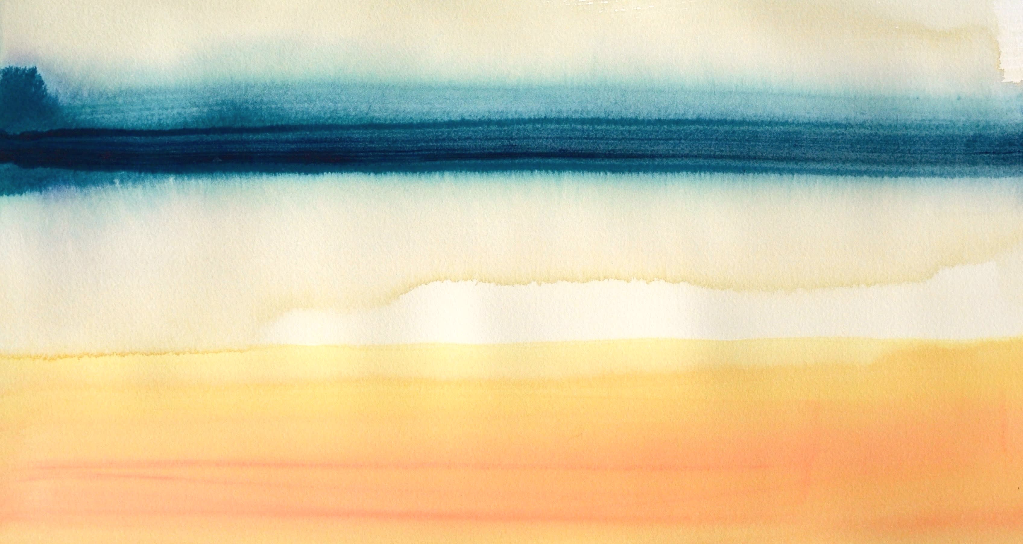
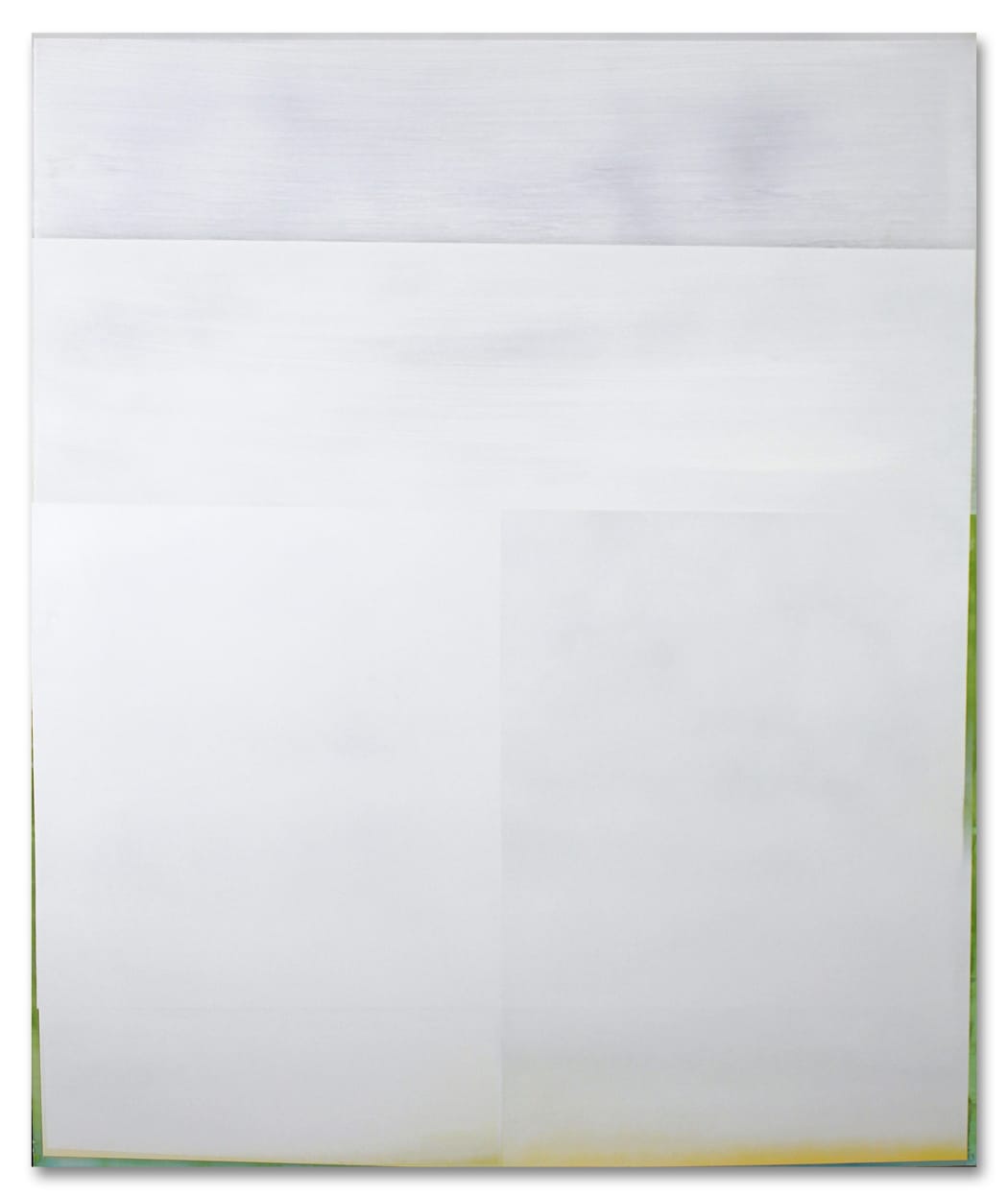
Susan English, "Horizontal/Vertical No. 10"
Work on paper has been an integral part of Kathryn Markel Fine Arts' program since it began. During our interview with Kathy for our 40th anniversary, she tells the story of transitioning from being a traveling salesman for Landfall Press in Chicago to moving to New York and starting her own gallery for original works on paper. It was a natural progression from selling prints, and working from flat files alone suited her small space in the Upper East Side perfectly. Focusing on paper also aligned with Kathy's mission of making the art world more accessible and democratic, which has not come without its challenges:
Work on paper gets no respect from the art world. There are very few famous artists that only work on paper. For an artist to be famous, they also must work on canvas, sculpture, or installation. So unfortunately, since I've always been drawn to work on paper, the art world has never been particularly interested in the artists I carry.
Also, I love and exhibit beautiful art - which is kind of a no-no. I don't show art that is political or conceptual - also a no-no. I’ve always had a problem with a painting or sculpture that is not compelling on it's own - a work that needs an explanation or a backstory in order to make it compelling. So much contemporary art requires a PHD in semiotics to understand it, and I find that very elitist. I’ve always thought that art should be for everybody. And that's the kind of art that I represent.
While Kathy started selling paintings as well, she continued to expand her selection of contemporary works on paper that are beautiful as well as visually and intellectually rigorous. They also serve as a particularly good gateway for collecting art, and here's why:
-
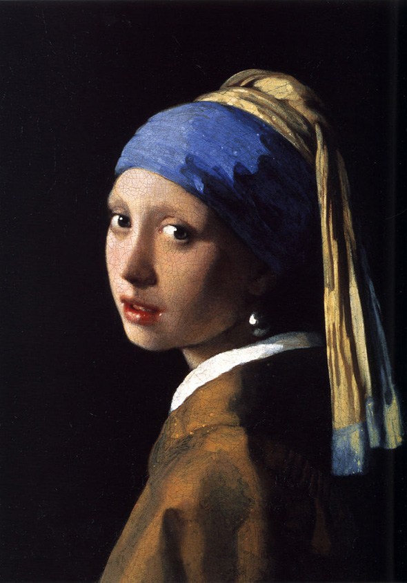
Whenever we talk about how to get started as an art collector, we stress the importance of looking. Before you set out to buy, you need to know what you like, and the only way to know that is by taking in as much art as you can. Now, when you're doing this you're most likely going to be looking at museums and focusing on bigger names and famous masterpieces. Forgive us for being presumptuous, but we're going to guess that those pieces likely won't be realistic purchases for when you're reading to buy. So, even once you've developed and understood your taste, how can you translate what you love about these high-end works into finding art that's more attainable? In order to help you bridge that gap, our So You Like series breaks down what you might find appealing about certain often-referenced artists in the contemporary art market so that you know what type of work to look for in the galleries you visit.
This time, we're taking a look at Vermeer.
-

On Monday, the portraits of Barack and Michelle Obama for the National Portrait Gallery were revealed. Painted by the renowned Kehinde Wiley and emerging Amy Sherald, respectively, the paintings are a stark departure from what we typically associate with traditional presidential portraiture. (Elaine de Kooning's JFK and Chuck Close's Clinton are other portraits hanging in the Gallery that have also represented a particular moment in art history that coincided with the presidency they depicted.) Unsurprisingly, the reception of the Obamas' portraits has been mixed. Are they successful, powerful representations of an historical moment - the first African American artists chosen to paint the portraits of the first African American First Family for the National Portrait Gallery - or were the artists' choices underwhelming and inappropriate?
We asked our artists for their reactions to the paintings and collected their commentary below.
-
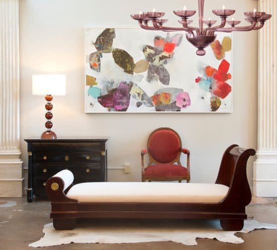
Let's Get Inspired
By Modern Victorian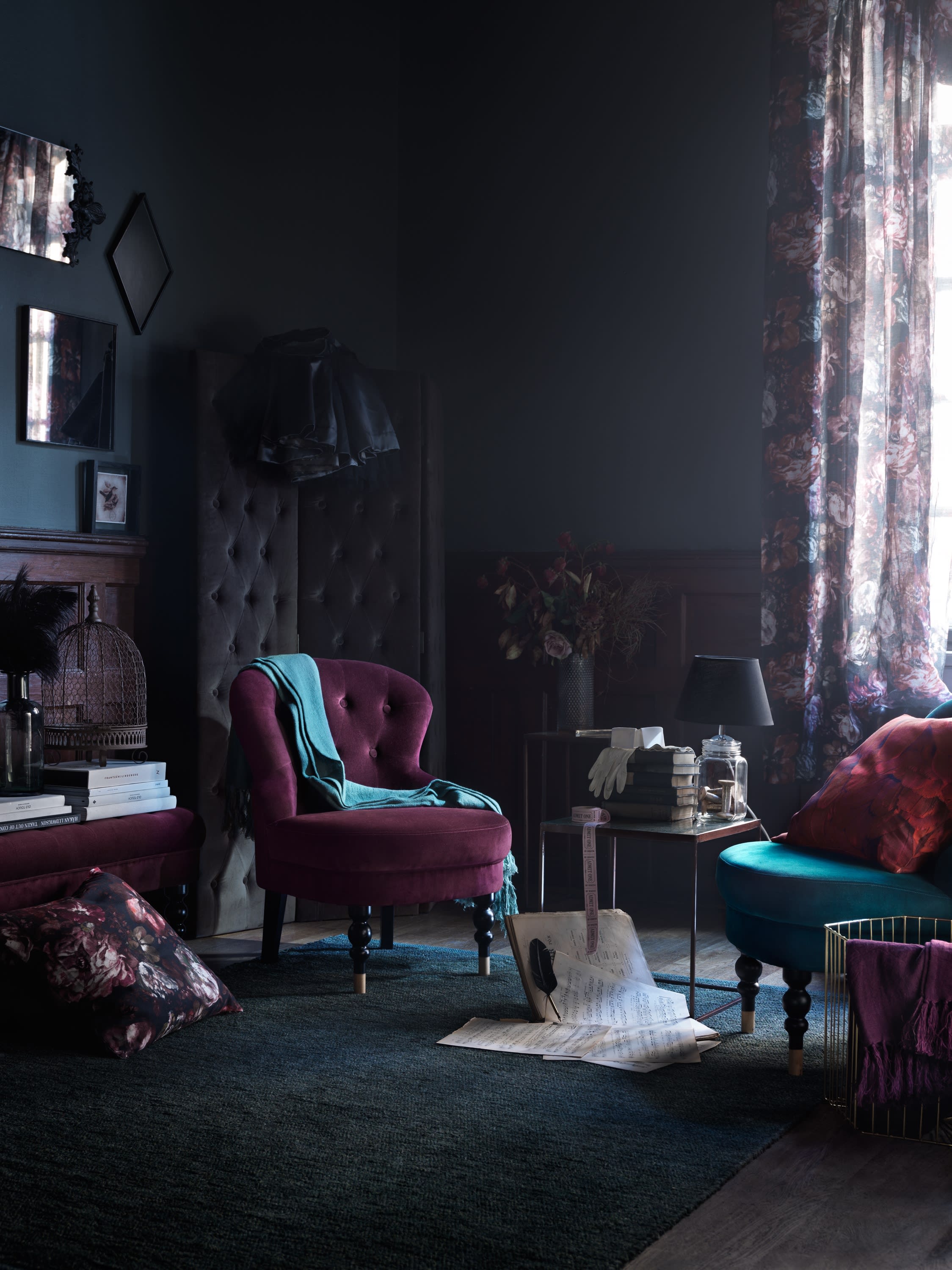
We're loving Emily Henderson's blog posts this week about an interior design trend she's predicting called Modern Victorian. It's all about updating classic, traditional styles in a fresh and modern way. A sofa with lines remniscent of the era may be amped up with a bold color or luscious textile, for example, or ornate furniture can be juxtaposed with sleek modern lighting. Henderson has coined the look as she predicts that trends will start to swing away from the minimalist decor that's dominated the scene for the past few years, and will start flirting with maximalism.
Of course, we're imagining what art may hang on these Modern Victorian walls. When we think of the type of art that was featured in Victorian homes, we jump right to still lifes and portraiture. Contemporary artists are playing with the traditions of these timeless subjects in a lot of interesting new ways, so if you're feeling inspired by the Modern Victorian vibe, why not extend the characteristics to your art collection?
Dive into the style with Henderson's introduction and guide to Modern Victorian furniture, then take a look at our suggestions for pieces that would fit right in.
-
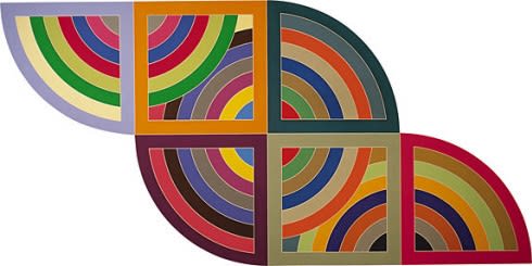
Whenever we talk about how to get started as an art collector, we stress the importance of looking. Before you set out to buy, you need to know what you like, and the only way to know that is by taking in as much art as you can. Now, when you're doing this you're most likely going to be looking at museums and focusing on bigger names and famous masterpieces. Forgive us for being presumptuous, but we're going to guess that those pieces likely won't be realistic purchases for when you're reading to buy. So, even once you've developed and understood your taste, how can you translate what you love about these high-end works into finding art that's more attainable? In order to help you bridge that gap, we're starting a new series that breaks down what you might find appealing about certain often-referenced artists in the contemporary art market so that you know what type of work to look for in the galleries you visit. This can also help you have conversations with dealers that can guide you toward pieces you might love much more effectively.
To start, we're going to take a look at Frank Stella.
-
 "Soho Morning" detail
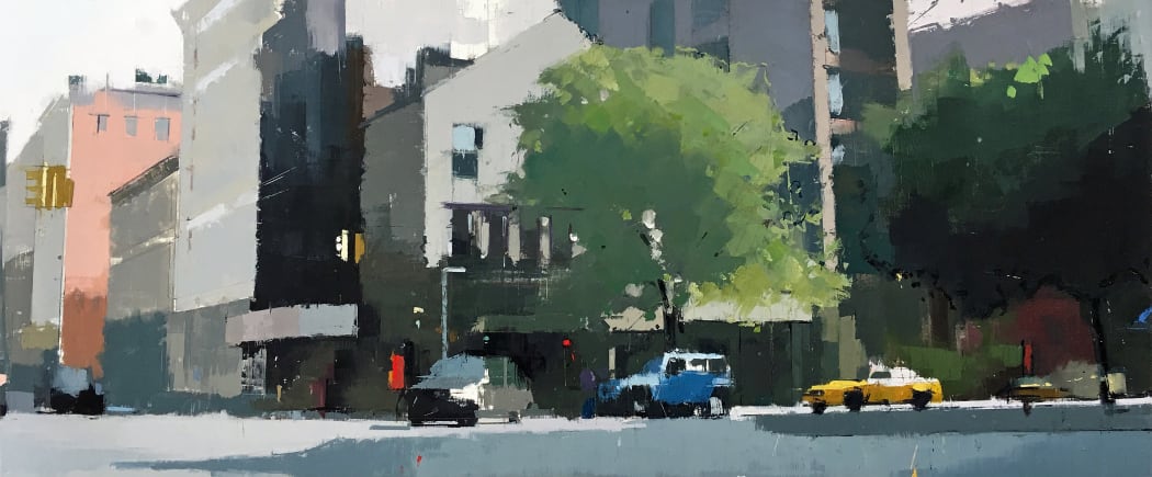
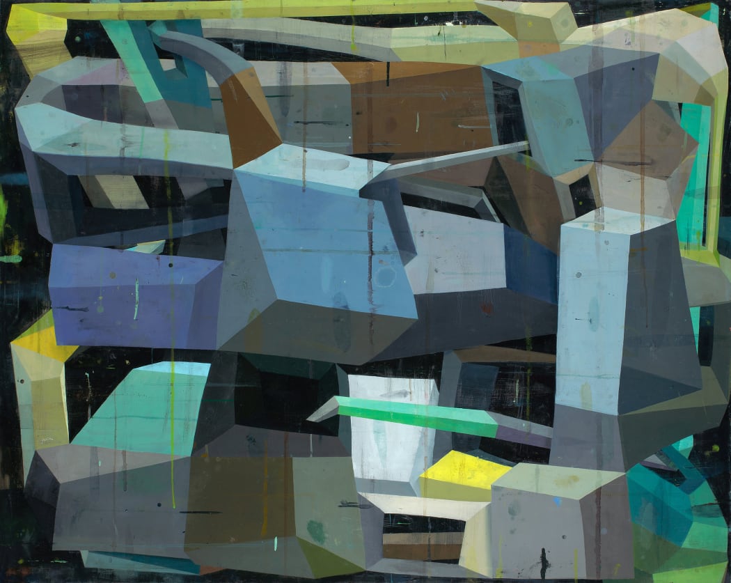
Lisa Breslow’s landscapes, cityscapes, and still lives are an exercise in contrasts. Both the natural world and architectural grit have a place in her work, highlighting the pull of New York City created by these opposing forces existing side-by-side. Breslow distills her depictions of nature down to its essence, creating atmospheric scenes activated by mood, energy, and light rather than a literal portrayal. The softness of her brushstrokes is grounded by the evident marks of her draftsmanship, amplifying the contrast between the serenity of the oasis and the driving force of the city surrounding it. We sat down with Breslow in her studio in Long Island City as she prepares for her forthcoming show, Recent Paintings, to discuss her process and perspective.
-
Every week, we'll be sitting down with one of our gallery artists to discuss their work, process, inspiration, and stories. This week we're speaking with Ryan Sarah Murphy.
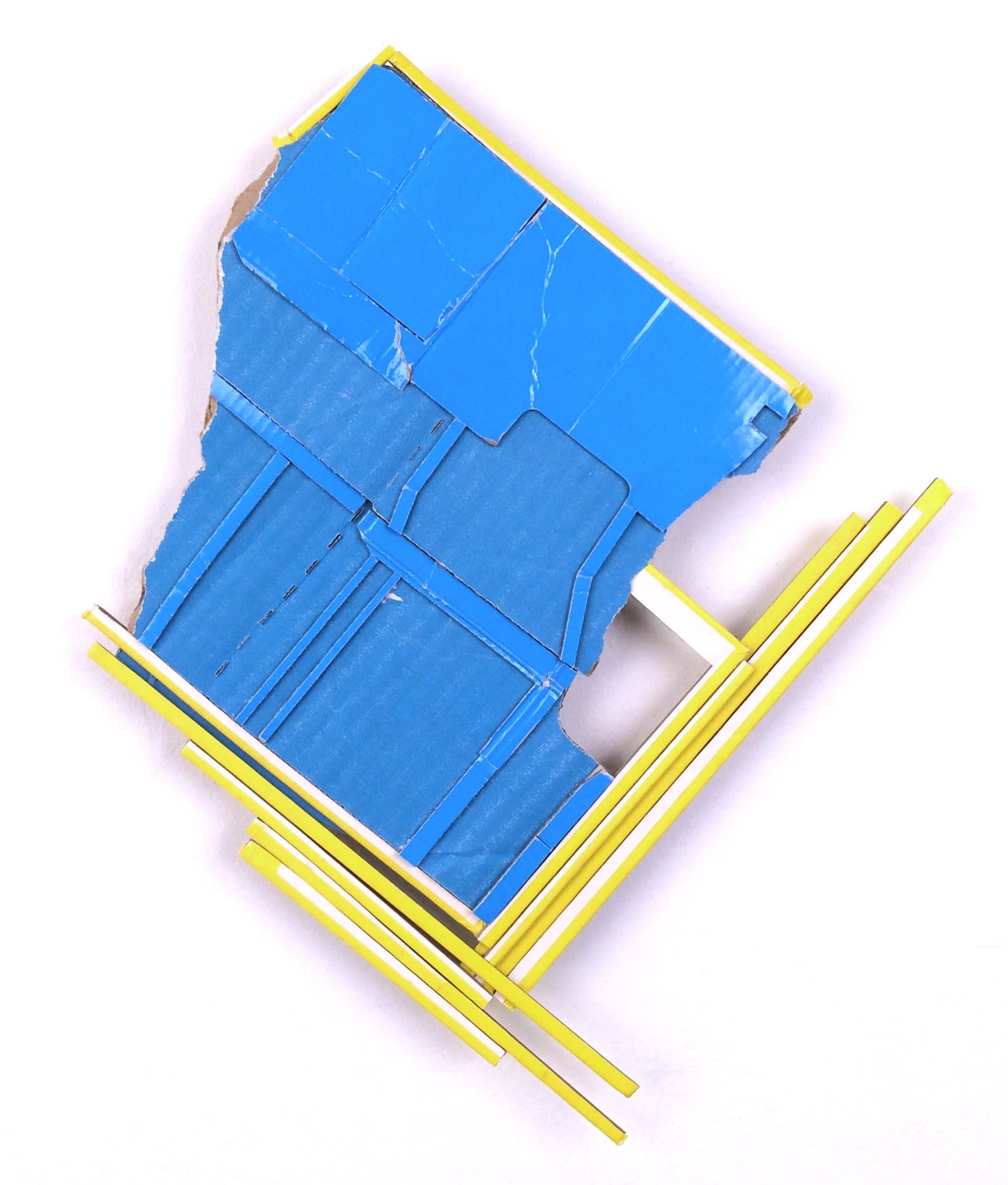
Ryan Sarah Murphy creates reliefs constructed from found discarded cardboard. She removes any identifying branding, text, or pictures, and uses what's left without painting, treating, or otherwise manipulating her materials. Working with a limited palette, she allows the remaining cardboard to serve as a guide, using its energy and unknown history to make her decisions as she assembles the relief. The final collages rest at the intersection of abstract and architectural elements, suggesting a strange terrain seen from an aerial view. The gritty remnants of an urban landscape are revived as bright, bold structures. We visited Murphy's studio in Manhattan to discuss the energy of found materials, working with color you can't create, and using completed works as a road map for new series.
-
Every week, we'll be sitting down with one of our gallery artists to discuss their work, process, inspiration, and stories. This week we're speaking with Nancy Cohen.
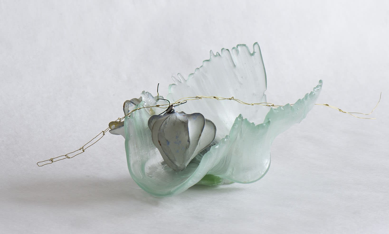
Nancy Cohen's sculpture explores the juxtaposition of fragility and strength. Made with a wide range of materials, but primarily with glass and homemade paper, the interdependent elements hang in the balance, a vulnerable but necessary part of the whole. Her work investigates the journey of the individual navigating a perilous world, all while exploring the fragility of that world itself. Through personal study of waterways and collaborations with scientists and environmentalists, Cohen imbues her work with academic references to a natural world that is fighting back while constantly under threat. She spoke with us from her studio in New Jersey about what appeals to her about her materials, how the tension between industrial development and nature inspires and reflects in her work, and her collaborative projects.
-
 Detail of "Raspberries 1"
Every week, we'll be sitting down with one of our gallery artists to discuss their work, process, inspiration, and stories. This week we're speaking with Dana Oldfather.
Dana Oldfather's work celebrates paint while blurring the line between figure and abstract. Semi-realistic underpainting inspired by friends, family, and TV is obscured by frenetic mark-making driven by anxiety. As the layers are built up in varying weights and opacity, the narrative is hidden behind abstraction with a pulsing energy. Through this process, Oldfather transforms her insecurities about her different roles as a woman in the world into bittersweet beauty, grappling with the belief that beauty's fullest potential can only be achieved by coming through the darkness. Oldfather talked with us about finding her voice, what she seeks to hide and enhance, and the effects having a child had on her work and process.
-
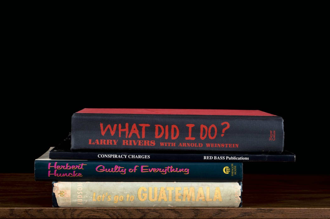 Detail of Nina Katchadourian's "What Did I Do?"
In conjunction with her solo show, "BTW," Deborah Zlotsky is also curating a group show titled "STACK." The word “stack” has many meanings, like voluptuousness (stacked), worthiness (stack up), and exploding in anger (blow your stack). With today's political divisions, the connotations lead quickly to “stacked against,” using power in a partisan way to force someone to do something or to tip the scales in favor of one side. Stacking, as a provisional and daily tool, creates order, minimizes sprawl, gives us agency and authority. It provides us with a feeling of empowerment and control. These themes are interpreted throughout the works on show in "STACK." We asked Zlotsky about what inspired the show and what her curatorial process was like as we start preparing for the openings of "BTW" and "STACK" on Thursday, May 11th.
-
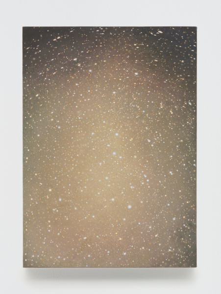
Our gallery director, Debra Marcoux, and gallery manager, Alyssa Alexander, both went to see Vija Celmins’ show at Matthew Marks and had very different responses to her work. Debra, already a fan of Celmins, appreciated the escapism of getting lost in her paintings of night skies and seas, and her meticulously detailed sculptures. Alyssa, new to Celmins’ work, was left searching for meaning. Here they discuss their experiences viewing the exhibition.
-
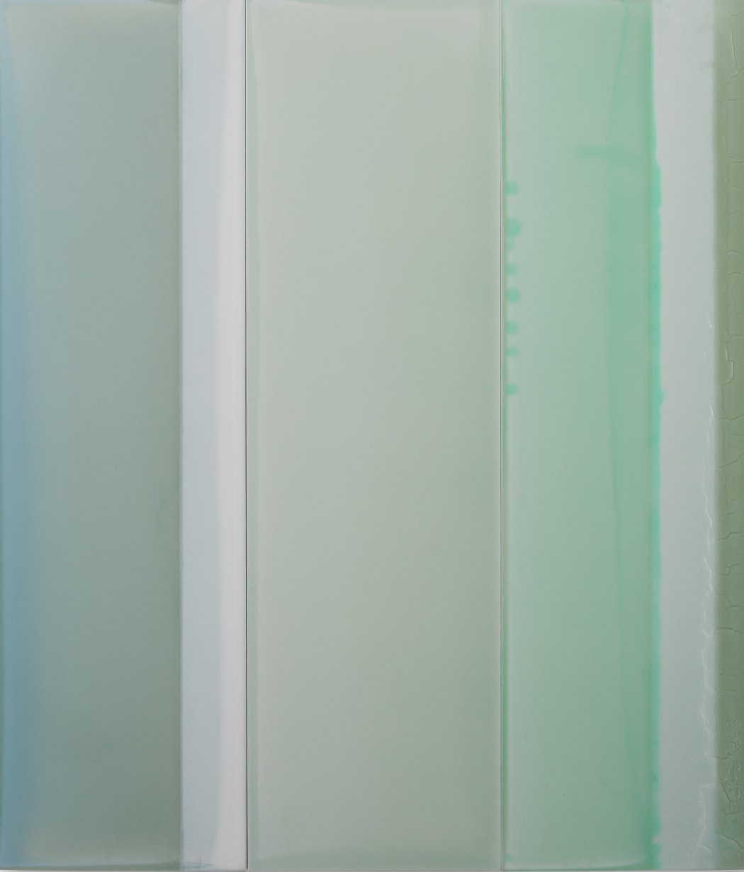 Detail of "Thirds No. 1"
Every week, we'll be sitting down with one of our gallery artists to discuss their work, process, inspiration, and stories. This week we're speaking with Susan English.
Susan English uses observations of light in relation to objects and spaces to create colors, atmospheres and surfaces in her work. Landscapes condense into shapes of color, and she portrays those shapes by pouring layers of tinted polymer onto panels. Those layers harden with various thickness and viscosity, the pools of paint, cracks, and coagulations creating enticing surfaces that capture a delicate relationship between control and accident. These panels are then assembled into horizontal or vertical sequences to create a narrative of color, space, and light. We spoke with one of our newest artists about her break with the Studio School, balancing intention and chance, and relearning how to see in an age of distraction.
-
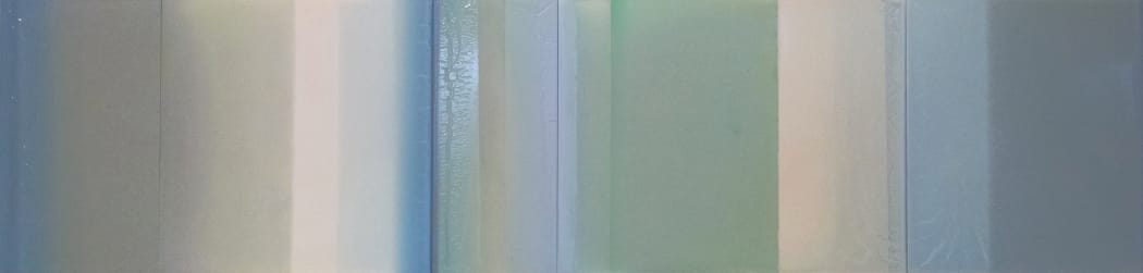 Detail of "Blue Shade," Susan English
We're pleased to announce we're now representing Stanley Bielen, Nancy Cohen, Susan English, and Ryan Sarah Murphy!
-
 Detail of "2016, I.III"
Every week, we'll be sitting down with one of our gallery artists to discuss their work, process, inspiration, and stories. This week we're speaking with Stephen Pentak.
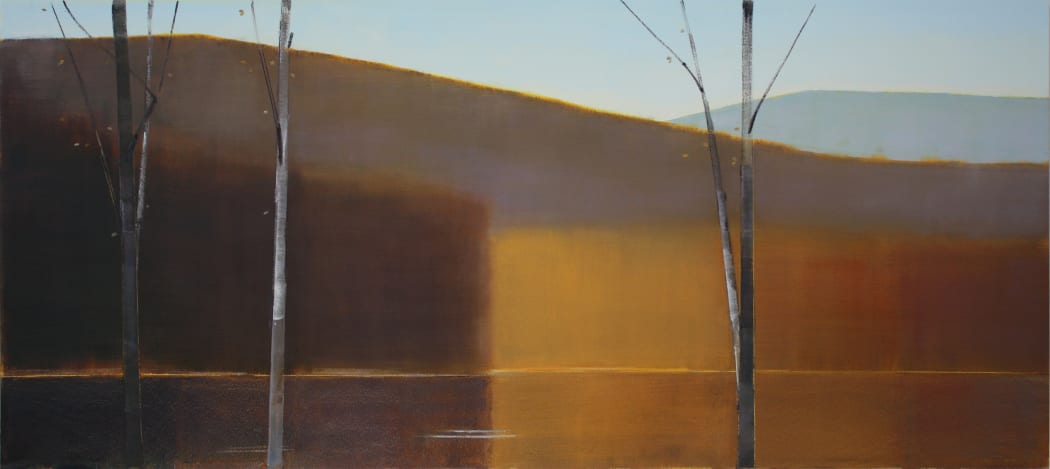
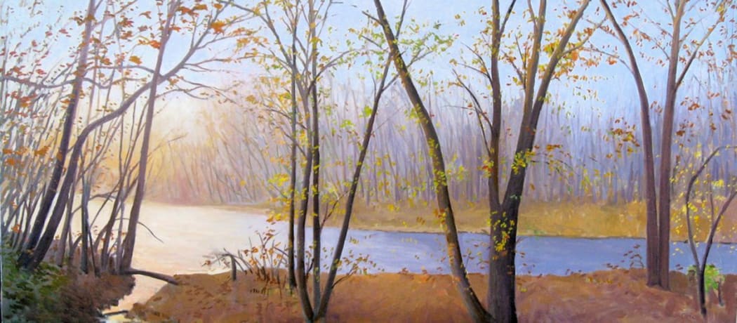
Stephen Pentak’s landscapes are variations on iconic themes. The scenes he paints from memory are familiar like a favorite bend in a river from childhood, and relish in how light affects nature. They appear tranquil and pristine from afar. Yet, as you step closer the evidence of his untraditional tools appear. His sweeping broad strokes of individual color are revealed, and one realizes that Pentak leans far more toward abstraction than originally perceived. Pentak spoke with us from his studio in upstate New York about transitioning from abstraction to landscape, the techniques he uses to distance himself from hyperrealism, and the direction he's taken to working in diptychs and triptychs.
-
Every week, we'll be sitting down with one of our gallery artists to discuss their work, process, inspiration, and stories. This week we're speaking with Don Martiny.

Feeling confined by the restraints of the canvas, Donald Martiny freed the gesture from traditional rectangular support. Using a mixture of his unique polymer and pigment, Martiny creates hyperbolic brush strokes, isolating movement and color as the work's essential elements. In his studio, he covers the floor in plastic so that he can work as freely as possible, using his hands, big brushes, or other tools to push his material intuitively around the space. Despite their typically large scale, the pieces offer an intimate closeness with their creator. Energy pulses from their movement and color, the fundamentals of expressionism reduced to their most essential forms. Martiny talked with us from his studio in North Carolina to discuss creating this process, the experimentation that went on in developing his materials, and thinking of these pieces as self-portraits.
-
 Detail of "Moxie"
Every week, we'll be sitting down with one of our gallery artists to discuss their work, process, inspiration, and stories. This week we're speaking with Fran Shalom.
Fran Shalom’s abstract paintings exist on the brink of recognition. Her playful forms flirt with nameable objects, shifting out of reality just as the viewer thinks they have begun to sense hints of representation. Yet her pieces defy being reduced to a metaphor. Her pop sensibility is represented in bold, electric color choices, and there is a push-pull between foreground and background, so that you’re never quite sure if the figures are breaking through or receding within the space. Fight the urge to make sense of her forms, no matter how tempting, and the piece reveals itself in the calm. Shalom talked with us from her studio in Jersey City in anticipation of her forthcoming show, "Turtles All the Way Down," about her transition from photography to painting, how her Zen Buddhist practice affects her process, and embracing a sense of humor in her work.
-
 Detail shot of "Edge"
Every week, we'll be sitting down with one of our gallery artists to discuss their work, process, inspiration, and stories. This week we're speaking with Peter Hoffer.
Peter Hoffer's landscape paintings are full of contradiction. Their scenes are serene and, at first, appear traditional. Shining with a glossy finish, they present themselves as neatly packaged. But look closer at the surfaces and you'll see that they are distressed, intentionally imperfect. The painting has drips and inconsistent marks, and the surface layers are scratched, cracked, and seared with various levels of subtlety. The pieces have the sense of being uncovered, invoking a sense of abandonment or anticipation. The painterly aspects of his work have increased throughout the years, further toying with that balance of precious object d'art and raw emotional experience. Hoffer wrote us from Berlin to talk about his road from aspiring hockey player to painter, his refusal to believe that painting is dead, and the origin of his finishing technique.
-
 Detail of "Reflective State 1"
Every week, we'll be sitting down with one of our gallery artists to discuss their work, process, inspiration, and stories. This week we're speaking with Elise Morris.
Elise Morris sees the infinite in the miniscule. Inspired by the subtle details of nature - light, pattern, and color - she creates richly layered works celebrating the tiny landscapes within overlooked spaces. Her paintings may be reminiscent of the space between branches, the curling of a leaf, or a rippled reflection in a pond. By turning her attention towards these small moments, she simultaneously opens up her awareness of the expansiveness of nature. The intricate workings she captures are representative of the vast complexity of the organic network they are a part of. They are soft and ethereal, yet lively and bright, much like their source of inspiration. Morris spoke with us from her studio in California about her process, the connection between creativity and parenthood, and building a community of artists.
-
 Detail of "Neshaminy Creek"
Every week, we'll be sitting down with one of our gallery artists to discuss their work, process, inspiration, and stories. This week we're speaking with Elissa Gore.
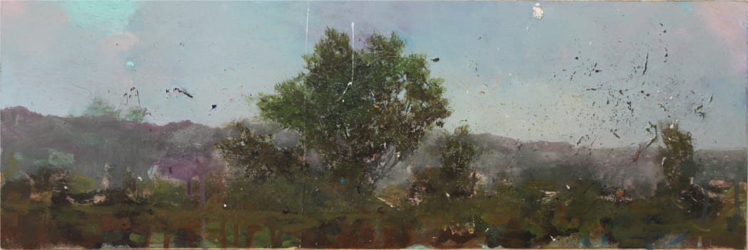
Elissa Gore's landscapes capture serene views, overlooked perspectives, and nostalgic connection to place. While based in New York City, she travels around the country creating plein air studies to use as references, often returning to the same places over and over to study their changes both drastic and subtle. We headed to her studio at the northern point of Manhattan after a summer packed with painting trips to discuss how her start in medical illustration still finds its way into her process, seeing painting as a conversation, finding the perseverance to push through self-doubt and creative blocks, and balancing being a landscape painter who loves living in the city.
-
Every week, we'll be sitting down with one of our gallery artists to discuss their work, process, inspiration, and stories. This week we're speaking with Daniel Brice.
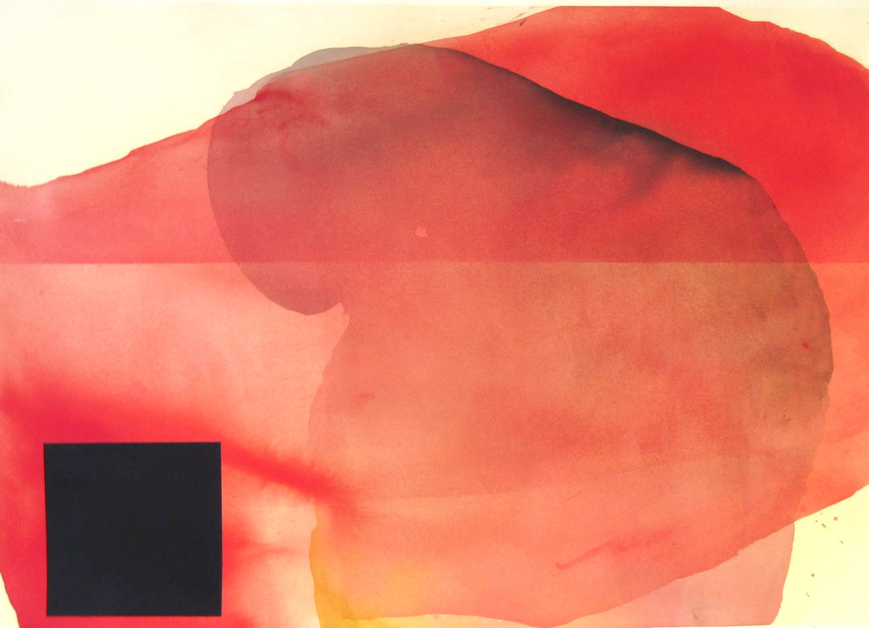
"Untitled NY 2"
Daniel Brice's dreamlike paintings take a shifting expanse of color and ground it with an idiosyncratic geometric form. His color fields appear to float in nothingness, their organic nature created by soft gestural lines, loosely built layers, and a tension between sparing use of color and richly developed hues. But the elegance of the watercolor hits against the starkness of the charcoal forms and the abrasive evidence of Brice's layering techniques, keeping the eye guessing as it wanders around the plane. This convergence appears active, line and color reacting to one another as they intersect and strive to find balance. Brice spoke with us from his studio in California about how he granted himself the freedom to find his voice, the puzzle of color, and the advantages of working on paper.
-
 Detail of "SBC177"
Every week, we'll be sitting down with one of our gallery artists to discuss their work, process, inspiration, and stories. This week we're speaking with Susan Cantrick.
Susan Cantrick's work is at the threshold of when sensation, emotion, memory, and intuition transform into cognition, capturing the moment at which the image begins to filter coherently into consciousness. She revels in the process of painting for painting's sake, a tool used for perceptual inquiry rather than representation. Sometimes experimenting with digital techniques to build up layers, Cantrick reworks and resolves the remnants of previous paintings to create something new, each piece rich with history. She spoke with us from her studio in Paris about how she developed this process, the benefits of her indirect path to becoming a visual artist, and the psychological exploration behind her work.
-
 Detail of "Great Open Sky"
Every week, we'll be sitting down with one of our gallery artists to discuss their work, process, inspiration, and stories. This week we're speaking with Liz Dexheimer.
Interested in reducing landscape into the most distilled information, Liz Dexheimer translates synthetic elements into a natural environment as a departure point. She deconstructs that manmade imagery, removing anecdotal markers, and explores the light and color that make up the essence of the place. While a limited palette creates an atmospheric depth, Dexheimer punctuates her work with an area of saturated single color to provide focus in contrast to the ethereal. She spoke with us about finding the universality of a landscape, exploring natural elements through manmade structures, and developing the confidence to trust her voice.
-
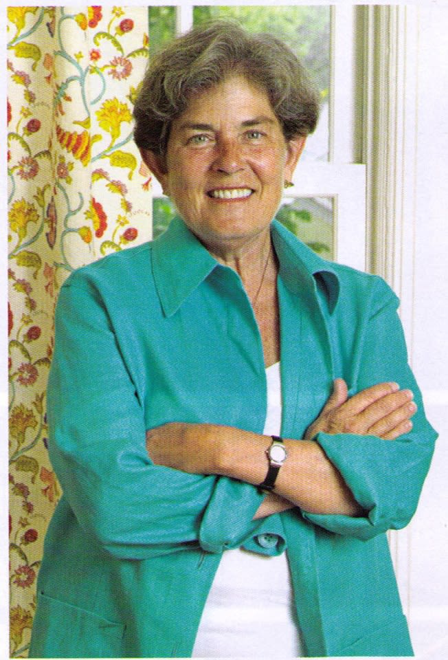
This month, Kathryn Markel Fine Arts will be celebrating our 40th year in business. We sat down with Kathy to look back over her career and share her thoughts about the art world today.
-
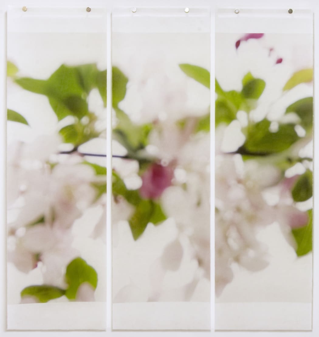 Detail of "Till It's Time To Go No. 3"
Every week, we'll be sitting down with one of our gallery artists to discuss their work, process, inspiration, and stories. This week we're speaking with Jeri Eisenberg.
Inspired by watching the changing seasons in the woods surrounding her home, Jeri Eisenberg's "A Soujourn in Seasons" series seeks to capture the ephemeral nature of a landscape. Photographing small details of trees and plants on a large scale, she uses an oversized pinhole or radically defocused lens so that only the strongest elements of her subject remains. The photograph is printed onto Japanese Kozo paper and then painted with encaustic as the panels are pulled over a hot metal plate, allowing the wax to fully infuse the paper. This creates an inherent luminescence to the work, interplaying with Eisenberg's fascination with the movement of light. We spoke with her from her studio in Upstate New York about developing this process, the personal parallels to the direction her work has taken, and about being "an unrepentant aesthete."
-
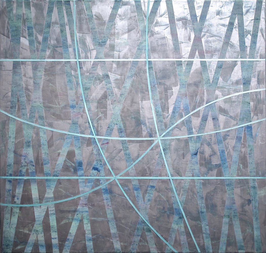 Detail of "Hour of the Morning"
Every week, we'll be sitting down with one of our gallery artists to discuss their work, process, inspiration, and stories. This week we're speaking with Gudrun Mertes-Frady.
Gudrun Mertes-Frady's work has an undercurrent of tactile layers of the full spectrum of color that is structured through metallic architectural lines. From afar, the pieces are serene and meditative, often seemingly monochromatic. But step up to the painting and the rich details appear in the hidden color peeking through and the physical remainders of Mertes-Frady's explorative process. The metallic pigments add to the mystery of the work, the colors ever-shifting with movement and light. The interplay of the geometric foreground and expressive background create both physical and psychic depth, the work forming its own center and logic as the elements shift into place. We headed to Mertes-Frady's studio in Brooklyn to discuss why she has hidden and revealed color throughout her career, the surprisingly intuitive process of defining those guiding lines, and the importance of creating honest work.
-
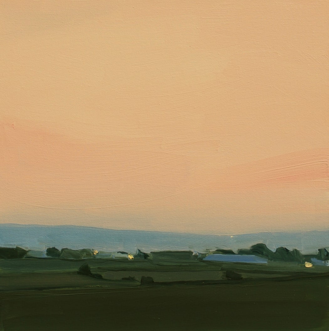 Detail of "Kingsport Sunset"
Every week, we'll be sitting down with one of our gallery artists to discuss their work, process, inspiration, and stories. This week we're speaking with Sara MacCulloch.
Taking in Sara MacCulloch’s landscapes can evoke an uncanny sense of familiarity. The scenes may resonate with the viewer, whether or not they have ever stepped foot in those surroundings. Her paintings capture the essence of a place and her emotional connection of experiencing it, rather than portraying minute details of representation. Typically completed in one studio session, her works have a sense of immediacy with their fresh brushstrokes. The overall impression of a MacCulloch landscape is one of muted serenity, but they have a lingering impact rooted in subtle shifts of color, painterly abstraction, and a lush organic palette. We talked with her from her studio in Nova Scotia as she prepares for her forthcoming exhibition, "Landscapes."
-
 Detail of "Orbifolds"
Every week, we'll be sitting down with one of our gallery artists to discuss their work, process, inspiration, and stories. This week we're speaking with Lorene Anderson.
Lorene Anderson's hypnotic paintings are abstracted landscapes influenced by the forces of nature. Characterized by their undulating stripes remniscent of the rolling countryside, they're activated by the phsyical depth of her layering, the vibrating figure-ground relationships, and the engaging conflict of postiive and negative space. Along with the departure point of landscape, they reference scientific concepts and energies as Anderson strives to translate those ideas into their visual representation. She talked with us from her studio in Oakland, California about why she's drawn to these influences, what's in her toolkit, and the controlled chaos of her process.
-
 Detail of "There is Only the Dance"
Every week, we'll be sitting down with one of our gallery artists to discuss their work, process, inspiration, and stories. This week we're speaking with Yolanda Sanchez.
Yolanda Sanchez's wildly expressionistic brushwork infused with the elegant control of calligraphy is grounded by the quiet of expansive passages of white canvas. Using color as a vehicle for experience heightened by gesture, composition, and texture, her paintings provide a poetic refuge from the day to day. They reference nature, but remain independent from narrative. Instead, Sanchez translates and projects emotional and sensational experiences. Subject and object are dissolved and replaced by a presence, the essence of a life force created by rhythm, harmony, and space. Born in Cuba, raised in Miami, and influenced by Eastern philosophy and Asian art, Sanchez's paintings have a culturally complex richness to them. They transcend borders and speak to the global human experience. We spoke with Sanchez about how she translates this into her work, how the variety of art forms she practices influence one another, and how her work is a reflection of her spirituality.
-
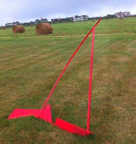
Every week, we'll be sitting down with one of our gallery artists to discuss their work, process, inspiration, and stories. This week we're speaking with Arden Scott.
Arden Scott's sculptures reflect a life spent on the water, an admiration for the lines ships cut through the river, and the details of the subtle intersection of artistry and logic of shipbuilding that can only truly be appreciated from seeing the process happening up close. Scott supported her art and her family through odd jobs around the city and had a studio in the shipyards of City Island before needing to move out to Long Island, where she then tried her hand at building her own schooner, named Annie, which she sailed around New York for nearly 30 years. Her minimalist sculptures capture the essence of ships, their curves and lines graceful yet strong, Her brightly colored large scale sails seemingly drift through the grass as if it were a marina, while the more intricate small scale works bring to mind rustic models that have escaped their bottle. Scott spoke with us from her home and studio in Long Island, detailing her relationship with art throughout her life.
-
 Detail of "BLUSH NEBULA W-2014-6-7"
Every week, we'll be sitting down with one of our gallery artists to discuss their work, process, inspiration, and stories. This week we're speaking with Ana Zanic.
Ana Zanic's work is a meeting of the gestural sponteneity of watercolor and the control of ink drawing. She begins with washes of watercolor, sometimes directing it with brushes, other times letting it drip and flow naturally across the paper. The result is a mapping of her intuitive process itself, which is then punctuated by dynamic lines of ink. The calligraphic marks call to mind something organic, yet intangible. They urge an intimate investigation into their creation and their meaning. We talked with Ana Zanic from her studio in Illinois about her creative upbringing, what she's exploring as she works, and why watercolor is such a perfect fit for her.
-
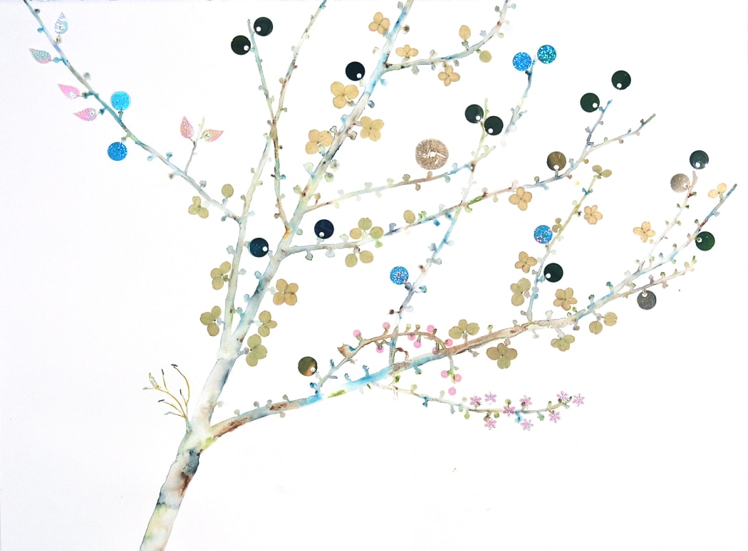 Detail of "Tree Buds"
Every week, we'll be sitting down with one of our gallery artists to discuss their work, process, inspiration, and stories. This week we're speaking with Marilla Palmer.
Marilla Palmer's mixed media works navigate the unexpected overlap of the organic and artifice. Dried flowers, foliage, and prints of spores are delicately combined with holographic paper, sequins, and wrappers to embellish renderings of found branches and plants. At first glance a celebration of the femininity of nature, upon closer inspection it's clear that Palmer is probing deeper. She selectively reveals the decay of her natural materials through the mask of her glamorous synthetics, questioning the power to fully transform through adornment. The worlds of the organic and inorganic - which are usually engaged in a battle for territory – come together to create a uniquely intimate portrait of Palmer’s surroundings. We headed to her studio in Brooklyn to discuss the challenges of being inspired by your environment, the intersection of nature and technology, and her reluctant path towards being an artist.
-
 Detail of "Untitled No. 742"
Every week, we'll be sitting down with one of our gallery artists to discuss their work, process, inspiration, and stories. This week we're speaking with Eric Blum.
Eric Blum’s layered arrangements of ink-washed, wax-infused silk are rooted in modern painting techniques yet activated by the experimental manipulation of his media. While initially drawing inspiration from the world around him, Blum dives into his work blindly, putting his materials through a process of layering, rotating, covering, and uncovering, until he settles the elements into a visual anagram, no longer resembling his own preconception. The ambiguity of Blum’s references and the elusiveness of his narrative is beguiling. Its parts don’t always go together and when viewed anew it becomes something other than itself; potentially more desirable, poetic or preposterous. He is drawn to unexpected juxtapositions and awkward harmonies with menacing undercurrents that don’t make a nuisance of themselves. We headed to his studio as he prepares for his forthcoming exhibit, "New Paintings" to discuss his work.
-
 Detail of "Cliffhanger," Marcelyn McNeil
Every week, we'll be sitting down with one of our gallery artists to discuss their work, process, inspiration, and stories. This week we're speaking with Marcelyn McNeil.
There is a tension in Marcelyn McNeil's oil paintings deriving from her prioritization of a sense of flatness while also considering her forms in a sculptural manner. McNeil's soft shapes engage with one another, forming dynamic relationships from how they occupy the space and the interplay of their colors. The composition appears both carefully considered and the result of free and playful exploration. Each piece is activated by an animated, almost peculiar, energy as the elements compete against one another across the plane. The added depth of McNeil's sculptural collages allows her to push these dynamics even further, creating an enticing complement to her paintings. McNeil spoke with us from her studio in Houston, Texas about the inherent conflicts of her work, establishing a process that honors both sculpture and painting, and finding clarity through color.
-
 Detail of "Bits and Pieces"
Every week, we'll be sitting down with one of our gallery artists to discuss their work, process, inspiration, and stories. This week we're speaking with Rocio Rodriguez.
Rocio Rodriguez work is introspective, yet rather than looking within she seeks to answer questions about painting as a whole. While breaking the artform down into its structural components and presenting them as totem-like forms to study as their own figures, she investigates the meaning of painting itself and its language. Frenzied line, gestural swaths of color, and geometric forms play out within the plane, sometimes seemingly floating freely and sometimes anchored by their relationships to one another or the hint of a horizon. Released from narrative or representation, the nature of Rodriguez's marks can be examined as answers in and of themselves to painting's creative problems and questions. Rodriguez talked with us from her studio in Atlanta about why this was important for her to explore, the process of transitioning from one body of work to the next, and the effects of being a studio junkie.
-
 Detail of "Fata Morgana"
Every week, we'll be sitting down with one of our gallery artists to discuss their work, process, inspiration, and stories. This week we're speaking with Deborah Zlotsky.
Deborah Zlotsky's work has the ability to feel like it is evolving before your eyes. You know the piece itself is static, yet the forms - at once geometric and gestural - appear to compete for space within the plane, pushing and pulling from background to foreground. Zlotsky relishes this quality of painting, animating the work by leaving evidence of its previous forms in drips and faded ghosts throughout the canvas. It echoes her process as she discovers the colors, shapes, and compositional relationships through a combination of intuition and intention, a constant shifting of balance and arrangement. She wrote us from her studio to discuss a process guided by restoring her own work, searching for connections and answers as a piece evolves, and how she moved away from a more academic approach framed from her training in art history.
-
 Detail of "Blues," Mary Didoardo
Every week, we'll be sitting down with one of our gallery artists to discuss their work, process, inspiration, and stories. This week we're speaking with Mary Didoardo.
Mary Didoardo's visceral, gestural abstractions are brought to life through swirling lines, textures, and colors. The depth of her panels evoke heightened emotions and leads to a psychological atmosphere. After years of working in both sculpture and figurative painting, Didoardo's current body of work is a meeting of the two states of mind, the intuitive manipulation of abstract space grounded in line. We visited her studio in Long Island City as she prepares for her forthcoming show, "Paintings," to discuss the elements she's pulled together from disparate areas of study, treating painting as sculpture, and learning to trust your work when it tells you it's finished.
-
 Detail of "At the Still Point 6"
Every week, we'll be sitting down with one of our gallery artists to discuss their work, process, inspiration, and stories. This week we're speaking with Tamar Zinn.
Tamar Zinn's latest series, "At the Still Point," which will be the subject of a forthcoming exhibition at the gallery, is exploring the culminating moment when the compositional tension of the work both activates and crystalizes the space. The geometry is revealed by the building up and scraping away of layers, working methodically in horizontal and vertical movements across the plane, until a moment of clarity is reached. The result is a field activated by depth and dynamism, the relationship of geometric elements and ambiguous space. We headed downtown to Zinn's studio to discuss tracing the evolution of an artist's visual vocabulary, balancing intuiton and intention, and discovering your paintings in poetry.
-
 Detail of Untitled Agnes Martin Painting
Name your five favorite artists.
Now, how many of them were women? The National Museum of Women in the Arts guesses that there weren't too many, if any, female artists on your list. So, for Women's History Month, they've started a campaign called #5womenartists to get people talking about unsung artists. Since we are five women working at a gallery where roughly 80% of the artists we represent are female, it's a cause we feel passionate about. Here are five of our favorite women artists:
-
 Detail of "Bird," Stephanie London
Every week, we'll be sitting down with one of our gallery artists to discuss their work, process, inspiration, and stories. This week we're speaking with Stephanie London.
Stephanie's London's paintings provide a quiet moment of beauty, a respite from from the bustle of our lives. Her thrifted objects in her still lives, like actors on a stage, command the attention with a mysterious sense of drama. Ultimately, her work reflects her Buddhist practice, exploring the same stillness and quieting of the mind that one finds in a state of prayer or meditation. London talked with us from California about the underlying narrative of her still life arrangements, finding fulfilment as an artist within an academic atmosphere, and the conflct of choosing between abstract and representational work.
-
 "Apophony"
Every week, we'll be sitting down with one of our gallery artists to discuss their work, process, inspiration, and stories. This week we're speaking with Martina Nehrling.
Martina Nehrling's eye-catching work is colorful, energetic, and invigorating. Her distinctive style of staccato brushstrokes allows her use of highly saturated color to shine, playing off the relationships of the color wheel to create a vibrating tension throughout the work. Nehrling works in a rhythmic minimalism, breaking down painting to its essence yet reveling in its sensational possibilities, guiding the viewer's eyes through a journey around the plane. Nehrling spoke with us from Chicago to discuss finding her voice as an artist, honing visual rhythm, and the controversial role of optimism in art.
-
 Detail of "Recurrent Dreams"
Every week, we'll be sitting down with one of our gallery artists to discuss their work, process, inspiration, and stories. This week we're speaking with Diane Ayott.
Upon first glance, Diane Ayott's vibrant, hypnotic works are an intriguing exploration of color and pattern. When viewed up close, they become even more transfixing as details of the marks are revealed. Ayott plays with technique and texture, and often incorporates mixed media materials that are typically not evident from afar. What may have initially seemed mathematical in process is now understood to be motivated by intuition. Ayott spoke with us from her studio in Massachusetts to discuss how she balances this relationship, her insatiable love of images, and the importance of keeping a sketchbook.
-
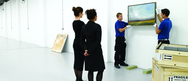 Photo Courtesy of Constantine Moving
Every week, we'll be your guide as you navigate the world of buying art in our series, The Collector.
After the initial excitement of buying a work of art has passed, it's time to start thinking about your next steps. Handing your check over is just the beginning! There are important things to take into consideration when it comes to properly caring for the work as well as getting your legal and financial ducks in a row. Thankfully, there are a bunch of experts to help you through theses processes and it's just a matter of knowing who to turn to.
-
 Detail of "Covers 24 Blue"
Every week, we'll be sitting down with one of our gallery artists to discuss their work, process, inspiration, and stories. This week we're speaking with Joanne Freeman.
Joanne Freeman strives to reduce her visual language down to its essence, offering up a quiet but confident impact. Her color statements against stark white backgrounds are at the intersection of geometry and gesture, their whimsical appearances supported by precise, controlled mark making. Excited by the convergence of fine art and pop culture, Freeman's works reference modern design, the Adriatic coast, and rock and roll. Just in time for her solo show, "New Paintings and Drawings," opening this week, we headed to Freeman's studio in SoHo where we sat down with tea, scones, and her dog, Coco, to discuss her latest work.
-
 Art of Paper
Every week, we'll be your guide as you navigate the world of buying art in our series, The Collector.
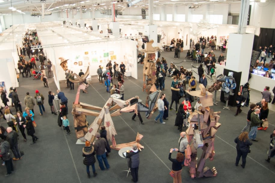
If you're a collector, the world of art fairs should be on your radar, but they may seem incredibly daunting. They have been an increasingly popular destination for collectors and art enthusiasts over the past few years, and are considered to be one of the most important outlets for dealing and socializing alike. But with the overwhelming number of options to attend and the potentially enormous scale of the fairs themselves, how do you even begin? The art fair season will be in full swing shortly, so we've put together a primer for the first-time attendee.
-
 Detail of "Rubber Match"
Every week, we'll be sitting down with one of our gallery artists to discuss their work, process, inspiration, and stories. This week we're speaking with Suzanne Laura Kammin.
Suzanne Laura Kammin is inspired by a wide range of influences ranging from Eastern philosophy to 1970's design. The resulting works are intensely vivid studies of color, self, and space that navigate the dynamic between hard and soft edges pushing up against one another within the frame. The juxtaposition of pure color, any evidence of mark making obscured, and visceral layers creates a visual give and take that nods to the concept of yin and yang, where opposite forces are interdependent. In anticipation of Kammin's upcoming solo show, "I Am That," she talked with us from her studio in Newark, NJ about the spirituality of her work, the evolution of her color sense, and unleashing the freedom in her paintings.
-
 Detail of "Winter Pages 6, " Julian Jackson
Every week, we'll be sitting down with one of our gallery artists to discuss their work, process, inspiration, and stories. This week we're speaking with Julian Jackson.
Julian Jackson's work has recently taken a departure from soft-focused studies of light to more formal linear works influenced by architecture. Connecting his series is a reverence for nature and art history, a precarious sense of balance, and an exploration of color. We met up in his studio in Brooklyn to dive into the evolution of his work, the early artistic influences that still shape his aesthetics, and finding inspiration in the origins of the world.
-
 Detail of Jeffrey Cortland Jones, "Notice (Fugitive)"
Every week, we'll be sitting down with one of our gallery artists to discuss their work, process, inspiration, and stories. This week we're speaking with Jeffrey Cortland Jones.
Jeffrey Cortland Jones' deceptively minimalist paintings reveal themselves in quiet, contemplative moments. There is a deft use of color in the face of their initially perceived monchromatic surfaces, a depth resulting from a rhythmic building up only to be broken back down again, and nods to overlooked landscapes, industrialism, and meloncholy. At times somber, gritty, or hopeful, these intimate works provoke a sense of calm as the viewer delves into what can be found within their layers. Jones writes us from his studio in Cincinnati about his relationship with color, his urban influences, and his evolution towards minimalism.
-
 Sarah Irvin's "Close Fade"
Every week, we'll be sitting down with one of our gallery artists to discuss their work, process, inspiration, and stories. This week we're speaking with Sarah Irvin.
Sarah Irvin's diverse body of work simultaneously explores the tangible - water lillies, the rhythm of a rocking chair, a baby's bottle - and the abstract - memory, heritage, motherhood. Her pieces are conceptual, with the process and motivation enhancing the painterly concerns of color, space, and gesture rather than supplementing them. Currently completing her MFA with George Mason University in Virginia, we spoke about the limitations of language, creating her distinct processes, and the effect her pregnancy had on her artistic point of view.
-
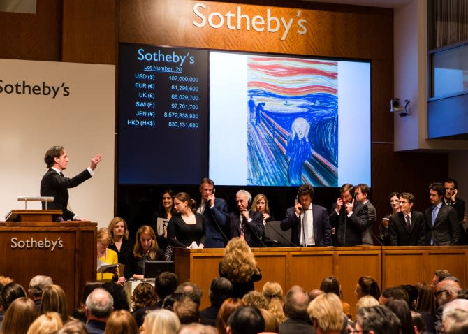 An Auction at Sotheby's, Photo Courtesy of Art Market Talks
Every week, we'll be your guide as you navigate the world of buying art in our series, The Collector.
The art auction is one of the most alluring parts of collecting art for many people. Simultaneously the most visible market (with its splashy headlines and glamorous guestlists) and the most mysterious (with its secretive bidders and sellers and its behind-the-scenes whispering), the world of auctions can seem inscrutable. There's language to be decoded and research to be done and gossip to be sifted through. (If you've been following the news in the art world lately, you'll know that there are some very juicy things happening in the auction houses of New York.) But once you're in the know, bidding at an auction can be a fun, exciting, and satisfying way to collect art. (Or you may think it's frustrating, vapid, and a rip-off. But that's for you to decide!)
-
 Detail of Sydney Licht's "Untitled"
Every week, we'll be sitting down with one of our gallery artists to discuss their work, process, inspiration, and stories. This week we're speaking with Sydney Licht.
Sydney Licht's work is often about subversion - the subversion of the traditional still life, the subversion of everyday objects into subjects worth studying, the subversion of what's considered disposable. Her still life paintings and her sculptures transform the mundane and the trappings of materialism into abstractions, something to be considered anew. As her art is inspired by her surroundings, she lives surrounded by her art in a loft in the TriBeCa neighborhood of New York City. Her living space is bookended by her studio taking advantage of the natural light from the east, and a space showcasing her completed works to the west. We sit down in her kitchen to discuss how self-imposed limitations expanded Licht's range, the relationships she explores between the man-made and the organic, and how her work is entangled with consumerism.
-
 Detail of "Purple Lake 12" by Susan Hambleton
Every week, we'll be your guide as you navigate the world of buying art in our series, The Collector.
There can be a misconception that prints are not as prized as paintings or works on paper, but collecting prints certainly has its own joy. Of course, there are many different kinds of prints, and it's important to be able to distinguish those that are of genuinely good value rather than just a mechanical reproduction of an original work. But, a good, artistically viable print can be seen as an extension of their entire artistic vision. More and more often, respected artists are making prints because they see them as an integral part of their work. Also, a print very often has a substantially lower price than its counterparts on canvas. If you're interested in prints, here's a guide on how to get started.
-
Marilla Palmer on "Space, Light, and Disorder"
A Conversation With the Curator of Our Latest Exhibition Detail of KK Kozik's "Czech", 2015
"Space, Light, and Disorder" is our current exhibition exploring the relationship of artists and chaos. The group show is curated by one of our gallery artists, Marilla Palmer, and we asked her to discuss her process of creating the show and her insights into what you can expect.
-
What is Art Worth?
Let's Talk Dollars and Cents Detail of "Wishful Thinking" by Suzanne Laura Kammin
Every week, we'll be your guide as you navigate the world of buying art in our series, The Collector.
Last week, we talked about art as an investment and (spoiler alert) concluded that it wasn't best to think of collecting art as an investment alone. First and Foremost, Buy What You Love!! But, it is important to consider the work's value. So, how do you know what a piece of art is actually worth? Figuring that out is one of the trickiest parts of buying art, even for total veterans of the art world. This week, we'll take a look at some basic concepts and rules for how art is priced and how to ensure you're getting a good deal.
-
 Detail of "Two Over Four" by Ky Anderson
Every week, we'll be sitting down with one of our gallery artists to discuss their work, process, inspiration, and stories. This week we're speaking with Ky Anderson.
Ky Anderson has set up shop in Pencil Works - a pencil factory turned coworking space in Greenpoint, Brooklyn - to create her lively paintings and run her various collaborative artistic projects. As an artist who works on many pieces at the same time, the studio is usually scattered with works in progress, but today space has been cleared at the work table and we sit down to talk over coffee about creating a community of artists, the themes she's exploring in her work lately, and the benefits of self-doubt.
-
How Can I Tell if This Art is a Good Investment?
(It Isn't.)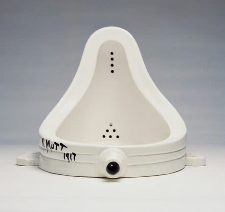 Duchamp's Urinal
Every week, we'll be your guide as you navigate the world of buying art in our series, The Collector.
If you're getting into the art collecting game with dollar signs in your eyes, you should probably take a seat and read this first. We hate to break it to you, but art is a crummy investment. Call us sentimental, but our number one rule when it comes to buying art is to buy what you love. Buy what speaks to your soul and what you can't imagine living without being lucky enough to look at it every day. If you're lured in by news of those million dollar sales, it's very likely you'll be disappointed. For one, the vast majority of artwork never goes up in value. Most art declines in value by 50% the minute you walk out of the gallery. It's also not liquid. Typically, a dealer who sold you a piece of art will not buy it back later. They have new work to sell by the artist that they can get on consignment, and so they don't want to deal with older works that they have to pay for.
Also, determining the value of art is one of the trickiest parts of the art world and market. Just like any other market, the art market fluctuates over time, and predicting the rise and fall of any one piece's value is near impossible and, for the most part, essentially based on luck. Art is a subjective medium, and a lot of what goes into buying it is purely based on emotions. It's futile to attempt to quantify those transactions rooted in something so intangible. How do you turn taste and public opinion into a formula?
-
 Laura Fayer, "Coral Grove"
Every week, we'll be sitting down with one of our gallery artists to discuss their work, process, inspiration, and stories. This week we're speaking with Laura Fayer.
Laura Fayer's studio is nestled in her classic apartment in Jackson Heights, Queens. It's clear from the moment you step inside that one of the driving forces of her work is color. Bright paints, palettes, and mixed pigments cover the work tables, an index of colors stands at the ready to be sorted through, and ideas for inspiration are tacked on the wall. Printmaking tools sit next to Japanese rice paper, and stacks of sketches lay in wait. We sit down to discuss how all of these elements come together in her deceptively complex work.
-
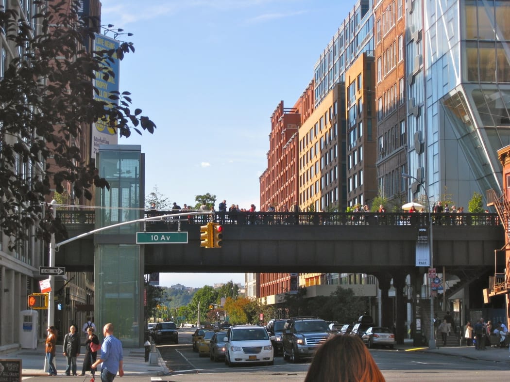 The High Line in Chelsea, photo courtesy of Trail Tramps
We're lucky to be in one of the city's biggest gallery districts, Chelsea, and love being able to stroll around our neighborhood to see all of the wonderful shows our neighbors are exhibiting. But it wasn't until relatively recently that Chelsea became so synonymous with the art world. New York's galleries have had a long and winding path, matching the ebb and flow of the growth of the city itself.
-
An Introduction to the Markets For Contemporary Art
Or “How Can I Tell If This Gallery is Tacky?” Kathryn Markel Fine Arts' Bridgehampton Location
Every week, we'll be your guide as you navigate the world of buying art in our series, The Collector.
If you're ready to start searching for your first piece of art, it'll help to have some insight into how the contemporary art market is organized. There are a few different things to consider to narrow down your hunt.
-
 Detail of "Snowpearl" by Josette Urso, 2013
Every week, we'll be sitting down with one of our gallery artists to discuss their work, process, inspiration, and stories. This week we're speaking with Josette Urso.
Josette Urso's bright, airy studio is in the heart of Bushwick, Brooklyn, in a loft building with a sweeping view over the borough, the Manhattan skyline shining on the horizon. Her workspace blends seamlessly with her living space, works in progress hanging on the wall, palettes waiting next to brushes, drawings being sorted on a table. We sit down at her kitchen table, a plate of gluten-free chocolate chip cookies set out before us, and start to talk.
-
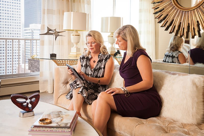 Photo courtesy of Heather Marx
Every week, we'll be your guide as you navigate the world of buying art in our series, The Collector.
When you're just starting out buying art, you may find it helpful to work with a consultant. These art experts/historians/therapists can help you hone in on what you love and where to find it, and it can be a very important relationship to develop. Some collectors always work with consultants, or you may find that she's helped you become so knowledgeable about art that one day you'll be ready to pass her on to your less experienced friends. Still deciding whether or not you need a consultant? Consider this:
-
Buying Art: A Glossary
Terms to Know to Talk Smart About Art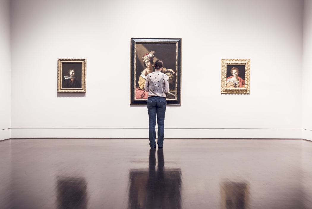
Every week, we'll be your guide as you navigate the world of buying art in our series, The Collector.
There's a lingo to learn when it comes to the art market. Before you begin on your journey to find the perfect piece of art, familiarize yourself with these common terms to ensure that you know exactly what you're looking at and (let's face it) whether or not you're getting ripped off.
-
The More You Look at Art the More You Learn About Yourself
My Favorite Painters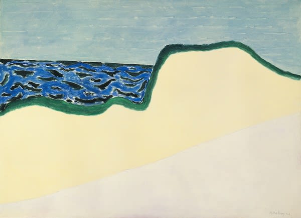 Milton Avery, "Dunes and Sea II"
Kathryn Markel takes a moment to reflect on her favorite painters and what they say about her.
The more you look at art the more you understand yourself. For example, I rarely respond to art with harsh gesture and color. It feels angry to me. But, others might appreciate the same anger I see and find it liberating, Where I may see the painting's energy as enervating, they could see it as exciting.
I've never cared for surrealism either. My brother used to recite his dreams at the breakfast table and, although I loved him, I hated to hear about his dreams. Surrealism reminds me of those arbitrary stories.
The fact is that, our reactions to everything in life are colored by our individual histories and physiology. There is always a dance between the stimulus and the stimulated. I rarely analyze why I like or dislike a dress, a taste, a person, or a wallpaper. But I always think about what it is in my personality that makes me react in a particular way to a piece of art.
-
 Meredith Pardue's Work in Its Home
Every week, we'll be your guide as you navigate the world of buying art in our series, The Collector.
If you're an intelligent, affluent, sophisticated consumer just starting to dip your toes into the world of art, the contemporary art market can seem overwhelming and intimidating. How do you know what you like? Where do you find it? Is it a good value? You've got to replace those college posters and the impulse buys you found in souvenir shops on vacation. But where to start?????
It going to take some time, but you are going to love learning about the art world and the art market.
Here are the three first steps to take for buying original art: